UI Case Study · Fintech
 Zalo
Zalo Banking Application

Everyday banking for South Africans: clear, friendly and easy to trust.
01 · The problem
Traditional banking still feels expensive, confusing and hard to trust.
In South Africa, many people still find traditional banking expensive, confusing and hard to trust. Zalo was designed to change that: a clear, friendly banking companion that helps people see where their money goes, plan for what matters, and feel confident every time they open the app.
Contextual user experience.
Zalo is built around how South Africans actually bank. The app is data conscious and mobile first, uses plain everyday language, and shows every fee upfront. Onboarding is simple and clear, and the experience keeps improving through regular testing and data-led iteration.
Clear content and clear navigation.
User research showed how people within Southern Africa talk about their money, so we used that same language throughout the app. The copy and information architecture follow the mental models users already have, so finding something feels familiar from the first tap.
Slick consistent design system.
A small colour palette and a single typeface keep every screen focused and easy to scan. These deliberate limits create a clear visual hierarchy and keep the interface true to Zalo’s brand values: clear, playful and trustworthy.
02 · Brand Values
Three values guide every screen.
We turned our research findings into eight design principles, and each one supports at least one brand value. Playful shapes and bright colour give Zalo its personality, while clear hierarchy and plain language keep the important things easy to find and easy to trust.
Clear
Each screen does one thing at a time. Generous white space, no more than three type levels per card and a single primary button guide the eye. Balances and totals are always the biggest thing on screen.
Playful
Rounded cards, pill-shaped chips and a friendly brand name give Zalo its personality. Quick, purposeful micro-interactions add delight, but never slow down a key task.
Trustworthy
Consistency builds trust. Payments, payees and savings goals sit in predictable places, and every card shares one structure. Familiar banking icons, local currency formats and no hidden fees make Zalo feel reliable from the start.
03 · Design System
Minimalist design system.
Colour
- Zalo Violet#6A00FF · Primary actions
- Deep Indigo#2E0B7A · Cards, headers
- Spark Orange#FF7A33 · Highlights, alerts
- Lilac#E8E3FF · Surfaces
- Peach#FFDDCF · Tags, warm tints
Type: Lato
AaAa
One family for the whole product. Hierarchy comes from weight, size and colour, and its figures are already tabular, so amounts line up.
Tabular figures
R 18 452,30R 55 748,15R 12 450,00Amounts stack and compare cleanly, without jumping when values change.
Iconography
 Dashboard
 My Accounts
 Transfer
 Spending
 Goals
 Statements
 Payees
 Alerts
Components
BUTTONS
CONTROLS AND TAGS
PAYEES AND ROWS
Groceries −R 415,08
Moved to savings R 2 500,00
04 · Key screens
Your money, at a glance.
Three screens cover what people check most: what they have, what they’ve spent and what’s coming in or going out. Each one leads with the number that matters, then gives a clear next step.
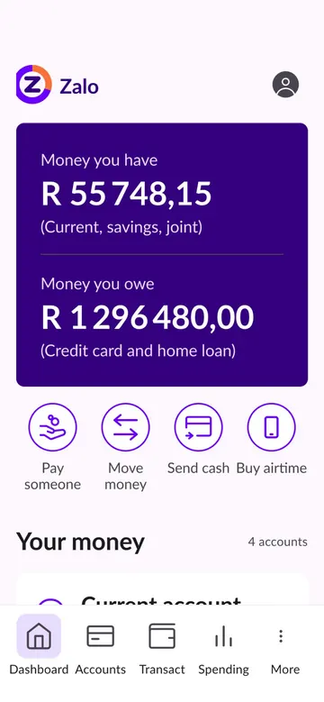
Home
Money you have and money you owe sit side by side, so you see your full picture in one glance. Quick actions are always within thumb’s reach.
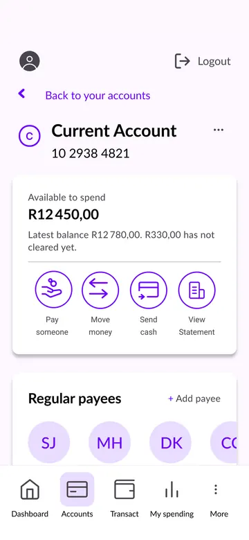
Current account
The amount available to spend comes first, with uncleared funds clearly explained. Regular payees and recent activity follow, so everyday payments take just a few taps.
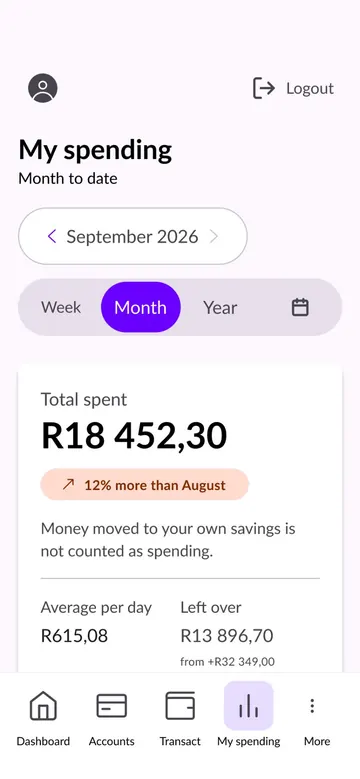
My spending
See what you’ve spent this month, how it compares to last month and what’s left over. Clear charts then break down where your money went.


05 · Across devices
One system, every screen.
Zalo uses one set of components that adapts to the screen it’s on. On mobile, cards stack in a single column with navigation at the bottom, within thumb’s reach. Tablet gives the spending chart and key figures more room to breathe. Desktop moves navigation into a side menu and adds a second column, so savings goals and fixed costs sit alongside your spending.

